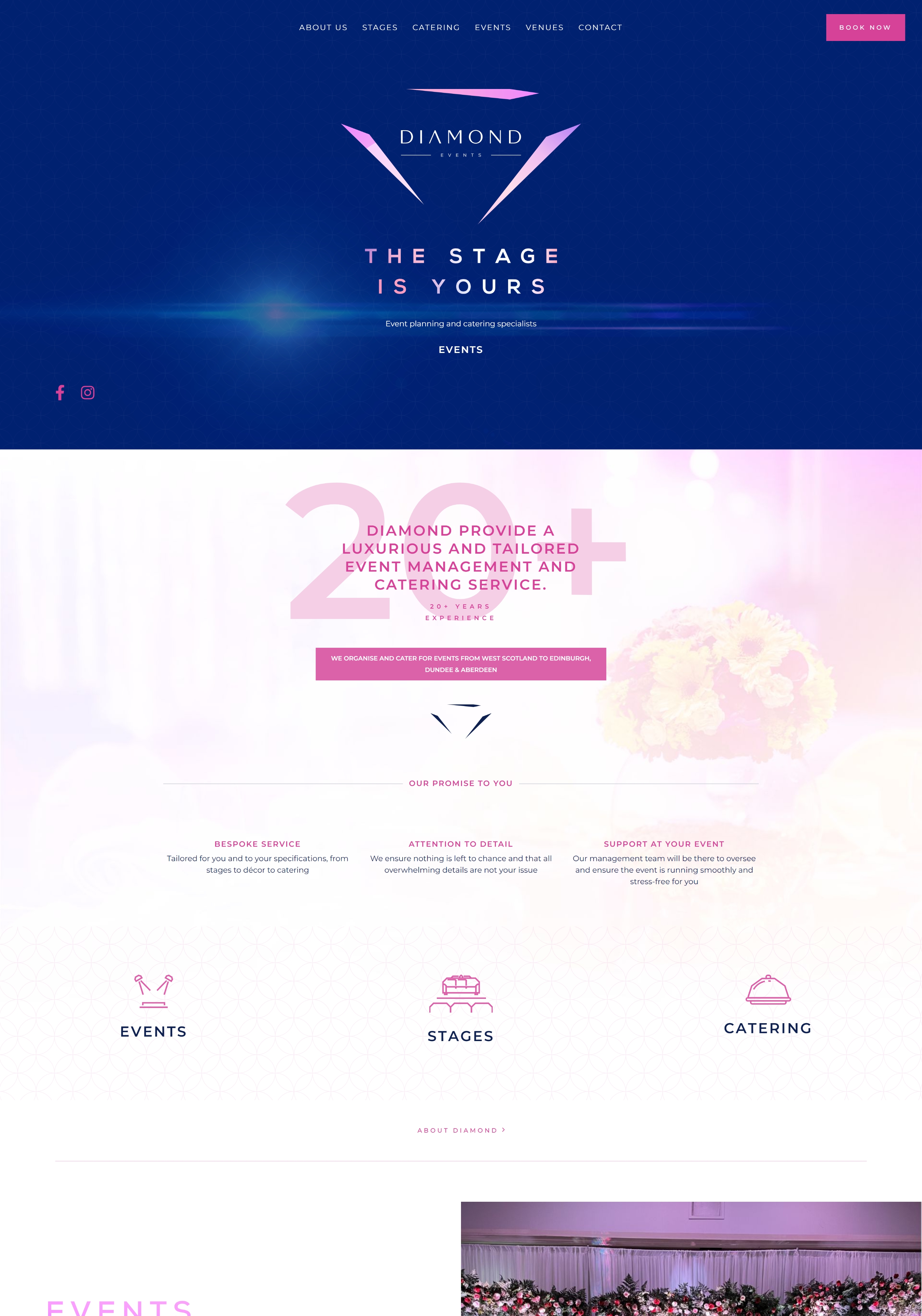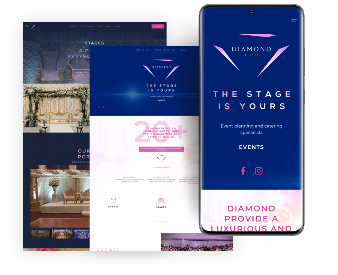


Diamond Events approached me for a complete rebrand of their business complete with a new website and supporting elements to go with it.
MENU DESIGN
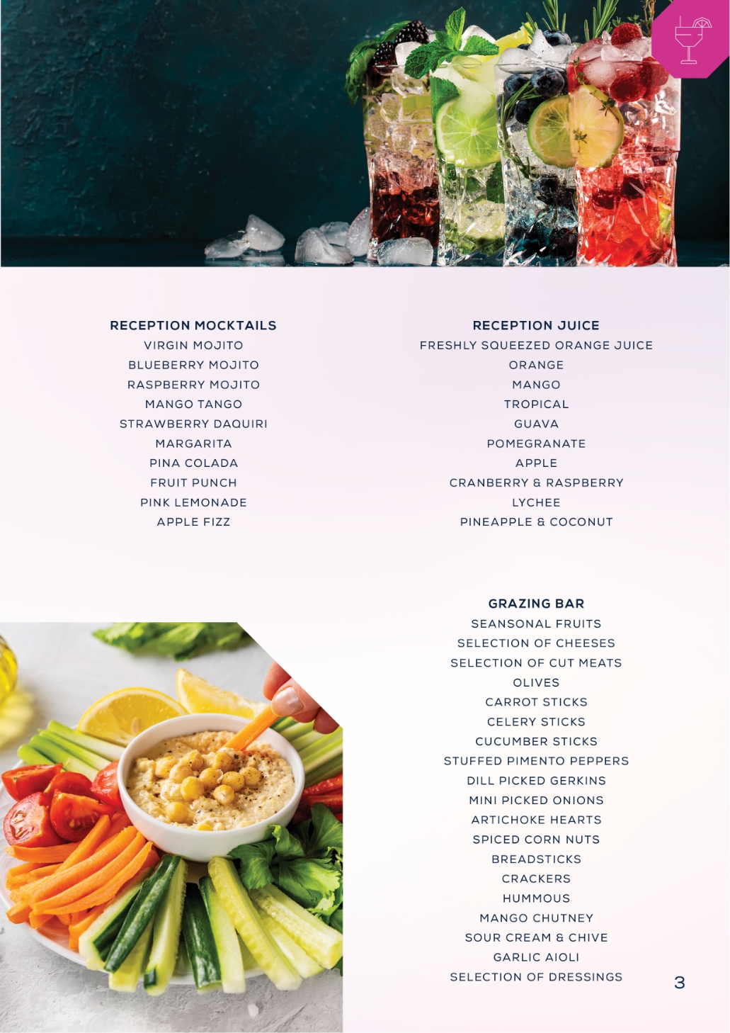
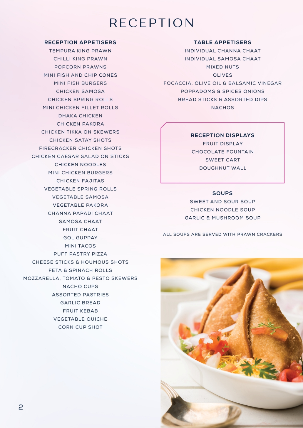
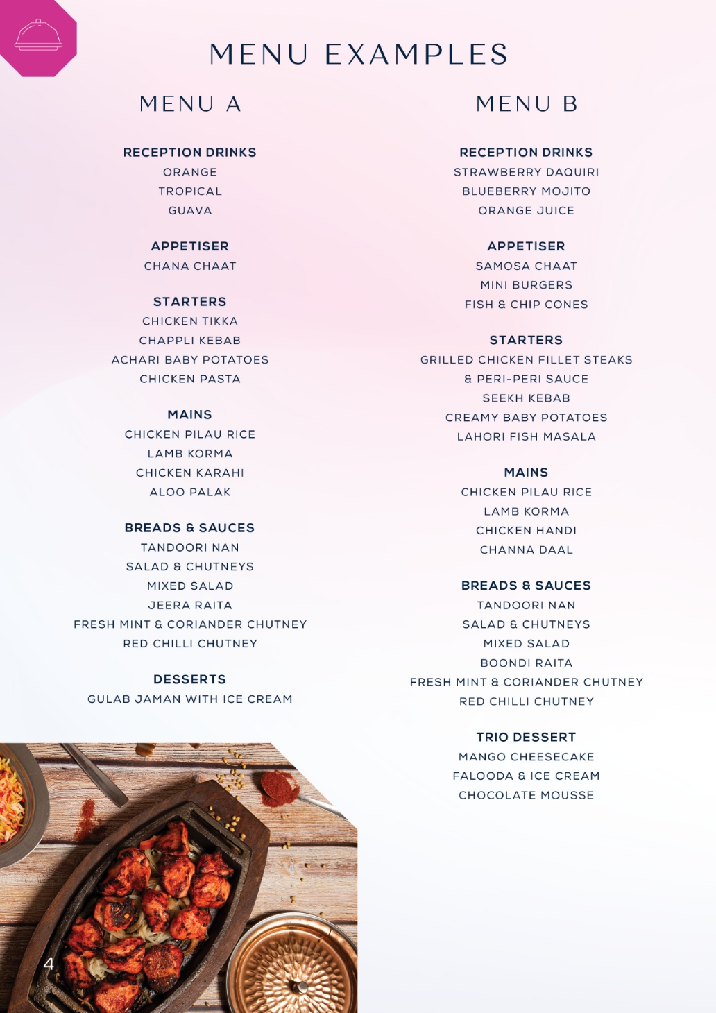
Menu design which incorporates the new brand, using the colour themes, imagery, typography and icon design


GRADIENT BRACKGROUNDS
We used a lot of gradient colour backgrounds for Diamond and encorporated it into their branding. The idea was to be luxury, but also distinctive, so we avoided using cliche colour schemes.

Diamond were already established and well known around Scotland, particularly Glasgow and Edinburgh. They approached me to redo their entire branding and also create a website for them.
The Website

Mobile Optimised


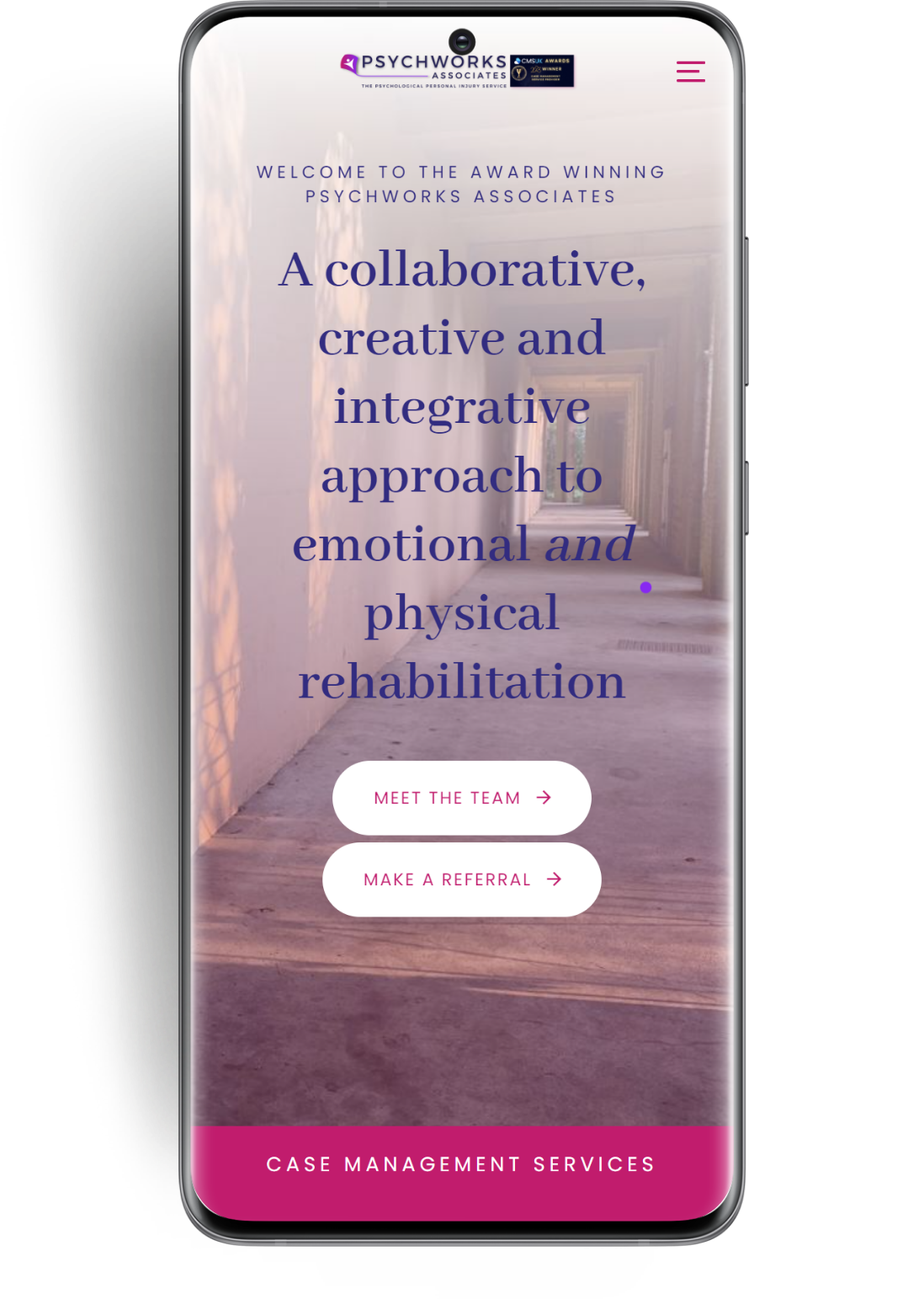
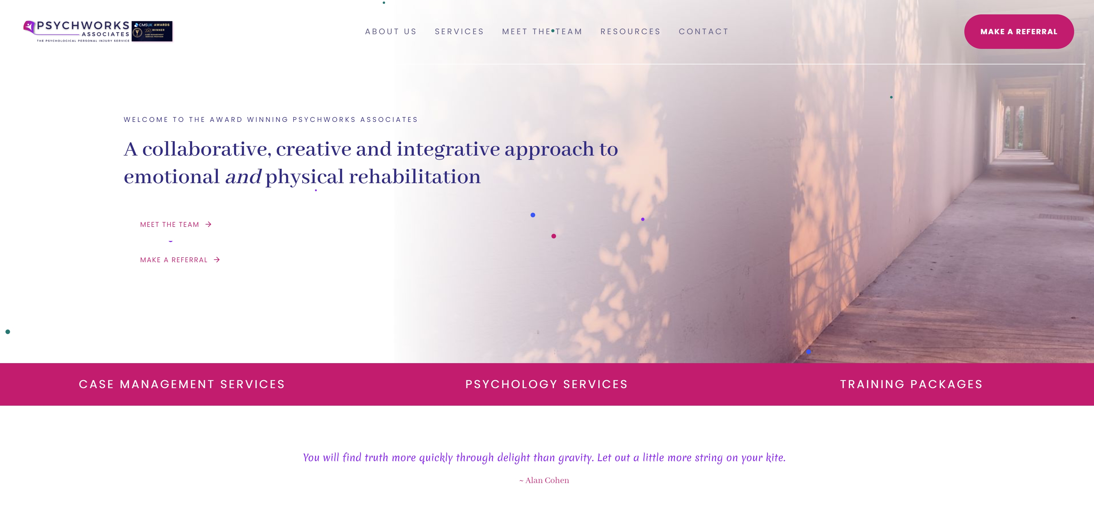
PsychwWorks Associates approached me for a complete rebrand of their company, and a new website. I desgined their logo based around the theme of a kite, using colours which the client specified. The website was built on wordpress using a premium theme, feauturing a lot of animated sections and linear movement, to evoke and portray the feelings of calm and ease.


Elixir Sport required a versatile logo and brand identity which could be easily adaptable. The logo itself needed to be simple enough that it could be presented in a variety of colours and then printed onto a variety of merchandise, such as t-shirts, sports gear, water bottles etc.
We approached this logo keeping the key brands in mind, Nike, Adidas. The theme across modern sports brands is a clear type, which is usually quite bold, and an iconic and simple logo glyph.
Working closely with the client, we went through a few variations of the liquid droplet idea, before the client stated that they wanted to use the symbolism of a person with their arms outstretched.
The final logo uses the main brand colours which are red and black.
We created a complete brand identity for Elixir Sport and wish them the best in all future endevours.
