Islamic Council



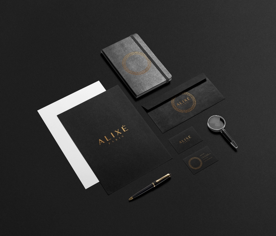
The logo went through a lot of fine tuning to make sure it was geometrical.
By limiting the spacings and aligning things equally, it creates harmony between all the elements of the logo.
This is a process I go through for most of my logos, but especially for ALIXE, it was important to have great attention to detail.
The pattern is a simple design consisting of 2 shapes, repeating all the way round in a circle. It is inspired by shapes found in old French architecture. The logo is therefore subtle but still linked to French heritage.
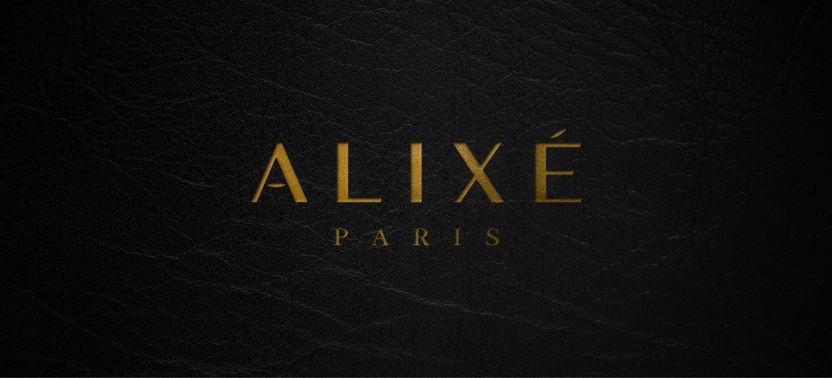
The final logo is colourless.
The logo will change colour and appearance based on the items and materials it's printed on.
Colourless logos are ideal for brands who's intent is to blend in with their products and not overpower/limit the products.
Colours create limitations in brands and so using a black/white logo makes it versatile.
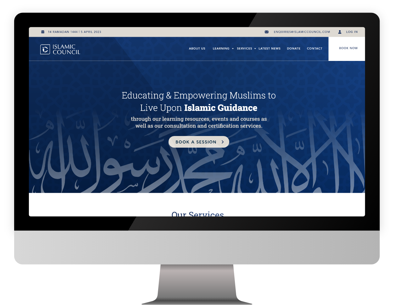
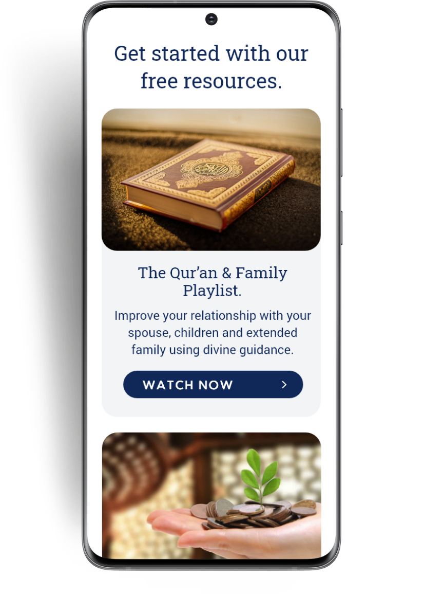
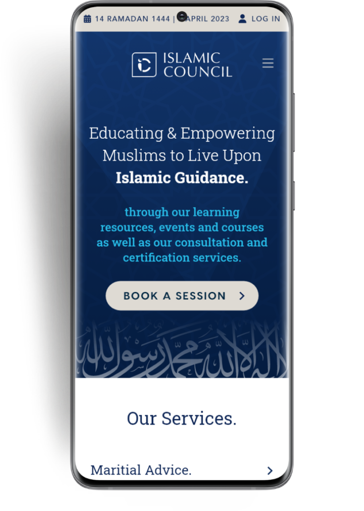
A website made on wordpress with a booking plugin integrated.
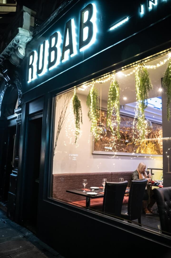

Big & bold, clear typography
Rubab opened in 2021 near Edinburgh city centre, along the tramline which leads into town.
The idea behind Rubab is a


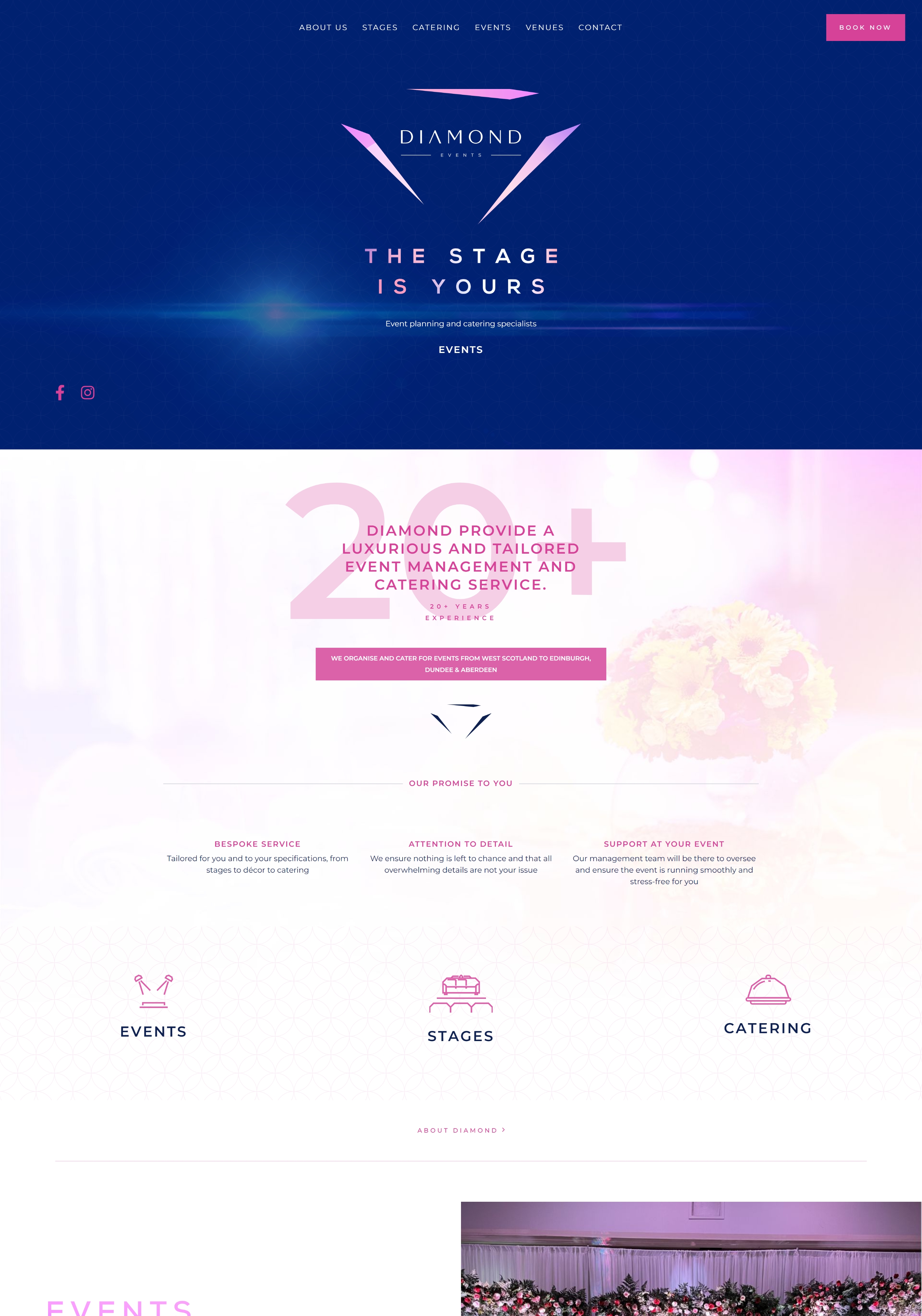
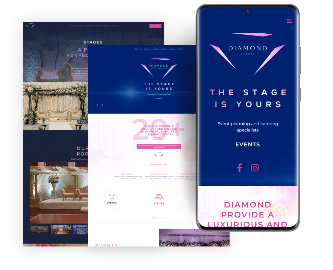
Diamond Events approached me for a complete rebrand of their business complete with a new website and supporting elements to go with it.
Menu design which incorporates the new brand, using the colour themes, imagery, typography and icon design
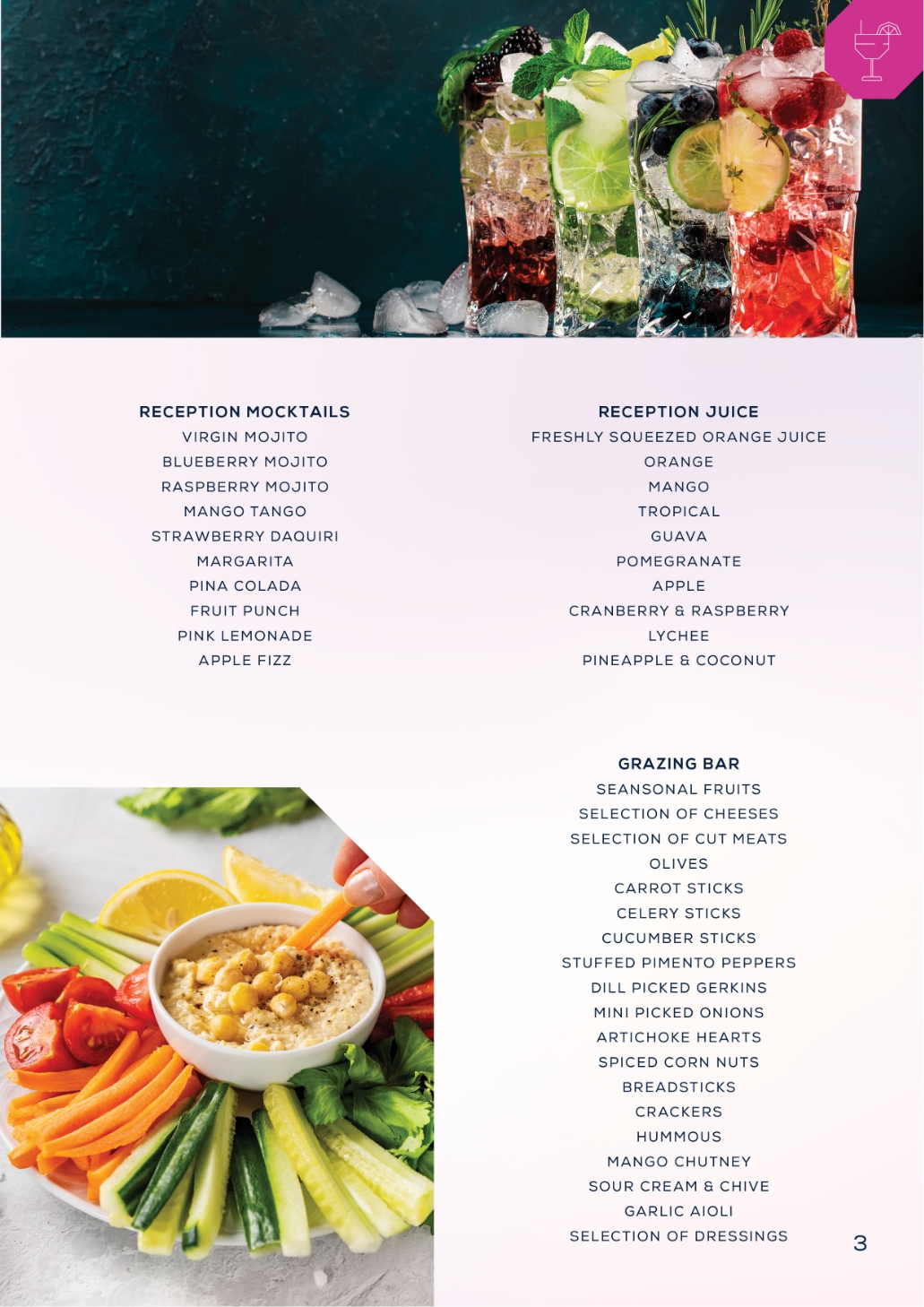
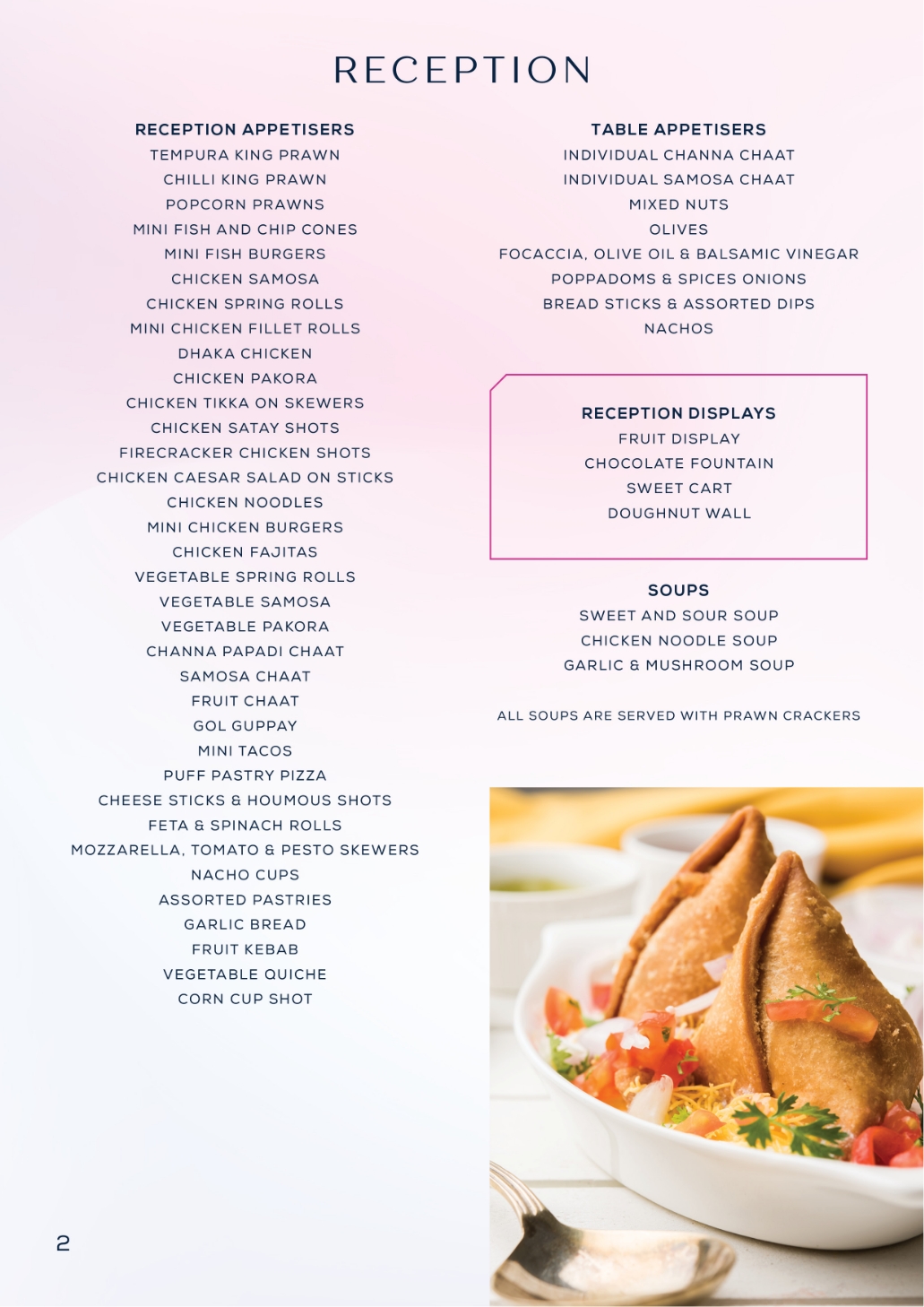
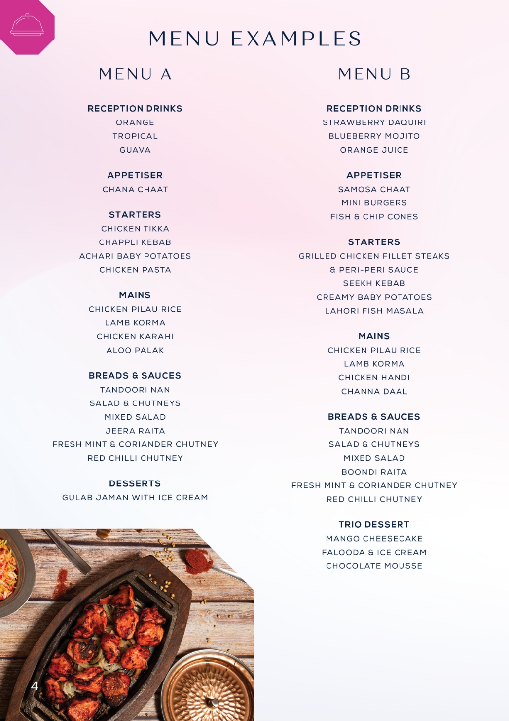

We used a lot of gradient colour backgrounds for Diamond and encorporated it into their branding. The idea was to be luxury, but also distinctive, so we avoided using cliche colour schemes.

Diamond were already established and well known around Scotland, particularly Glasgow and Edinburgh. They approached me to redo their entire branding and also create a website for them.
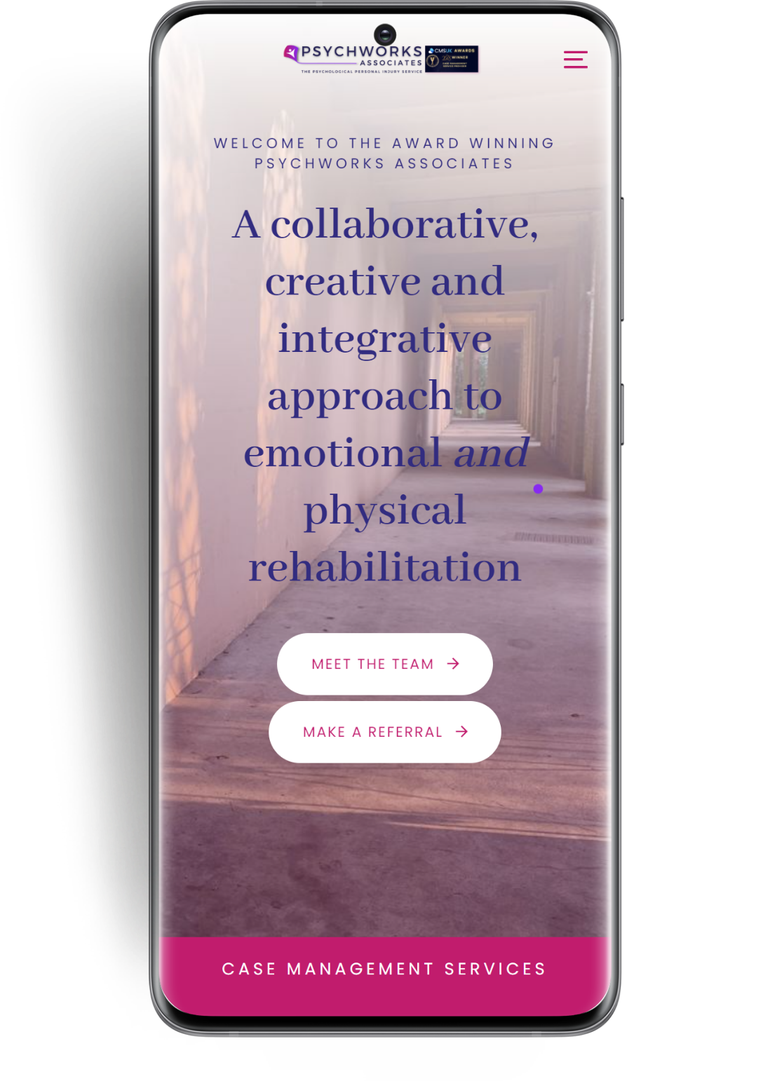
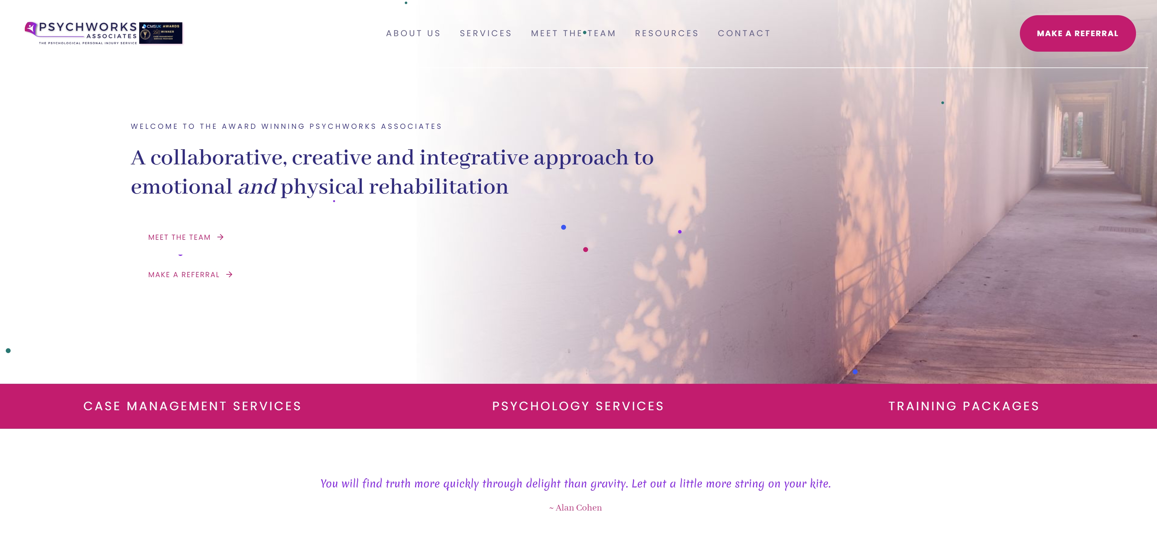
PsychwWorks Associates approached me for a complete rebrand of their company, and a new website. I desgined their logo based around the theme of a kite, using colours which the client specified. The website was built on wordpress using a premium theme, feauturing a lot of animated sections and linear movement, to evoke and portray the feelings of calm and ease.
