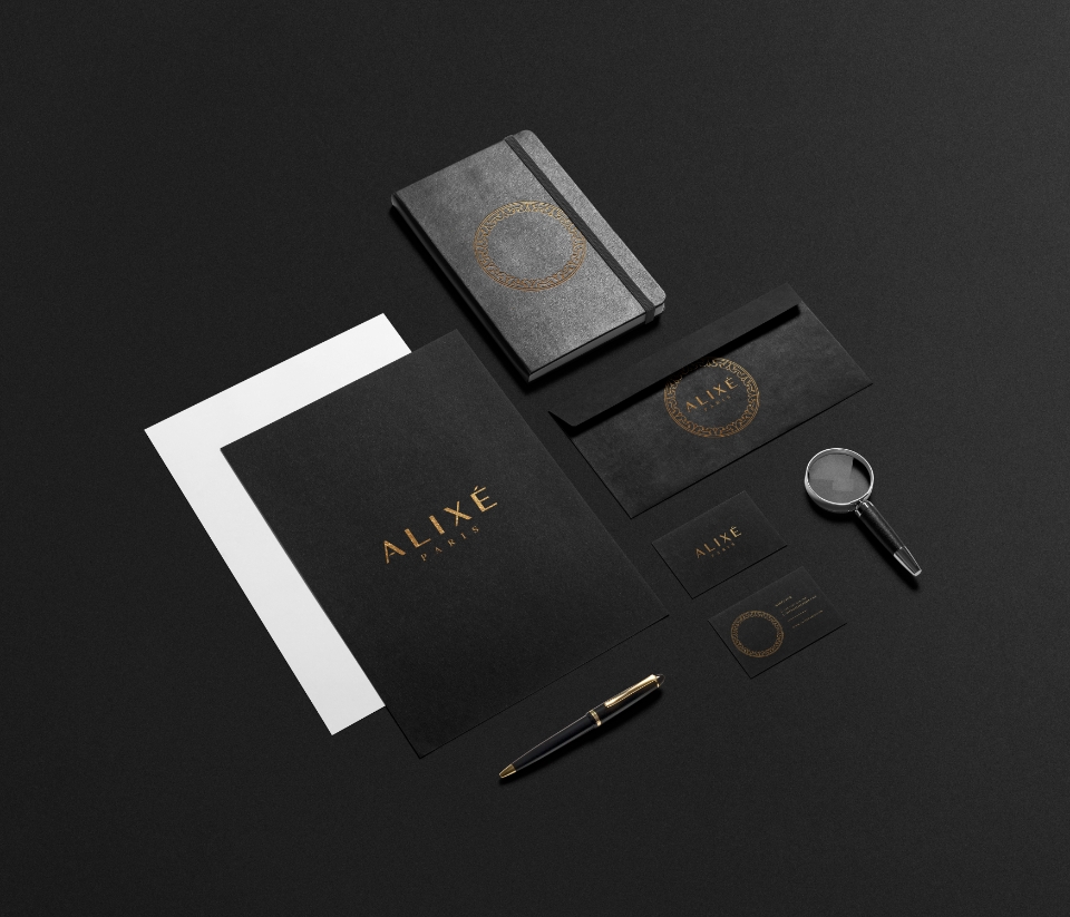


Attention to Detail
The logo went through a lot of fine tuning to make sure it was geometrical.
By limiting the spacings and aligning things equally, it creates harmony between all the elements of the logo.
This is a process I go through for most of my logos, but especially for ALIXE, it was important to have great attention to detail.
A timeless pattern
The pattern is a simple design consisting of 2 shapes, repeating all the way round in a circle. It is inspired by shapes found in old French architecture. The logo is therefore subtle but still linked to French heritage.


Simple elements that add a bit of character


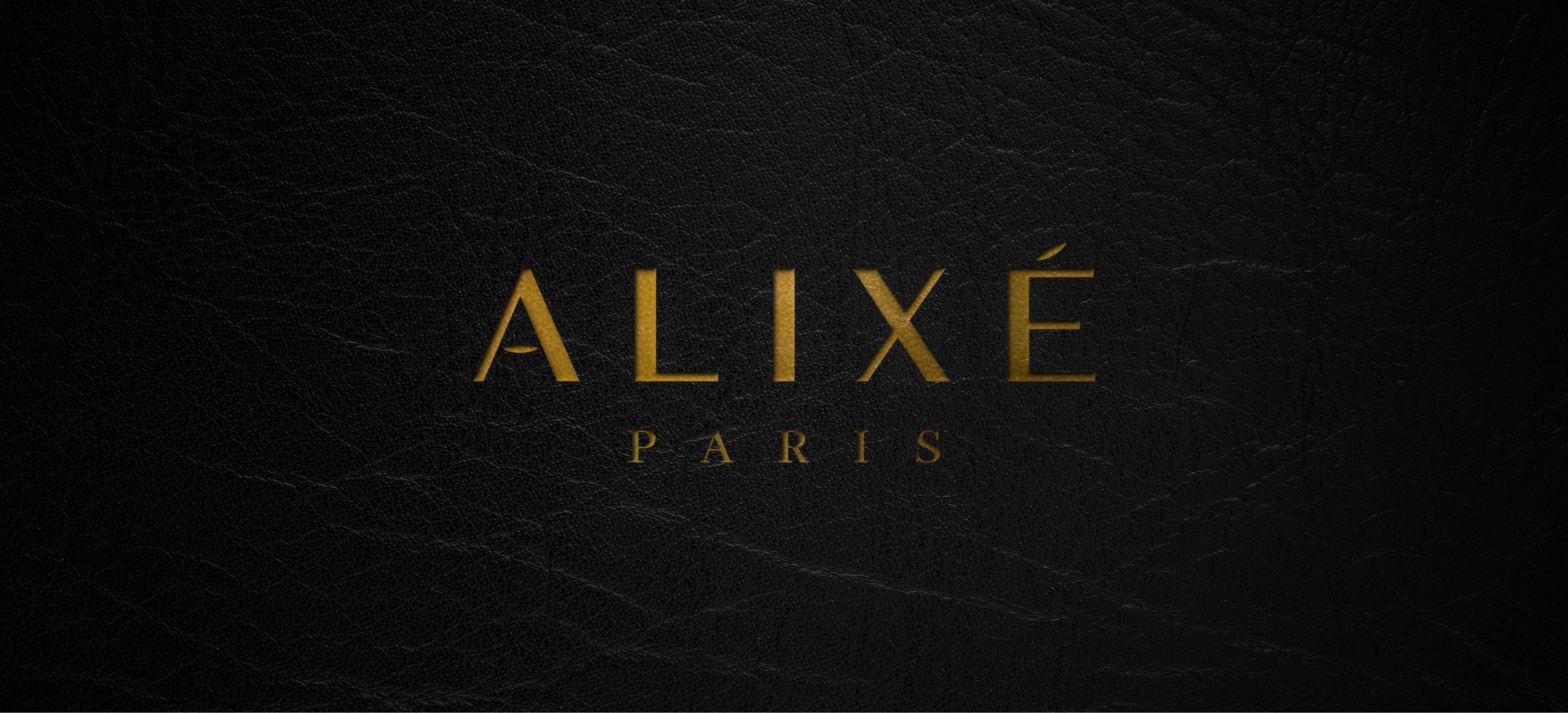
The final logo is colourless.
The logo will change colour and appearance based on the items and materials it's printed on.
Colourless logos are ideal for brands who's intent is to blend in with their products and not overpower/limit the products.
Colours create limitations in brands and so using a black/white logo makes it versatile.
Leather print mockup